Role
Product Designer:
Visual identity
UI design system
UX of core experience
Platforms
Web
iOS
Android
Audience
Children ages 5–9
Overview
Skybrary is a digital reading platform built around a simple idea: to put a book in the hands of every child.
Reading is Fundamental came to us with an existing app that got the job done, but visually and experientially, it felt dated. Our goal wasn’t just to give it a fresh coat of paint: we needed to modernize how the product looked, felt, and behaved, while keeping it approachable for kids and usable across web and mobile devices.
My primary focus was the visual design and user experience of the app, from browsing through books and videos, to searching for content, and adding favorites to your “backpack” for later.
The Problem
The existing experience had a few compounding issues:
The interface felt very dated vs the competition
A number of janky, unintuitive microinteractions that felt clunky and frustrating
The Solution
Modernize the product by:
focusing on core functionality
emphasizing ease-of-use
making it feel fun and inviting for an audience of 5–9 year olds in 2025.
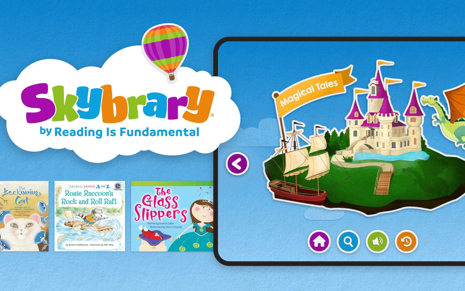
A big bet: make the app feel like a story book
Early on, it became clear that one of our strongest opportunities was visual. After diving deep into the UI of our competition, we discovered most of the best reading and learning apps in the space lean heavily into flat, vector-based UI. Many of them are indeed beautiful, colorful, and fun, but frankly they’re all very similar, and we needed a way to stand out from the crowd.
One day, an idea popped into my head:
What if the interface itself felt like a book?
So I cut up some construction paper to look like buttons in default and pressed states. I photographed them, and brought them into Figma to see how they’d fare. The sizing and lighting was way off but man the idea was cute!

A few of the hand-cut paper buttons
After much trying-to-make-it-work, I ultimately decided that fully-physical method was much more finicky and time-consuming than necessary, so I opted instead for paper-texture fills and subtle shadows to imply a tactile quality. This approach allowed me to sell the effect, but keep it buildable. I assembled an interactive moodboard detailing a number of different ways we could use the effect, presented it to the client, and they loved it!
The CEO herself said unprompted: “this feels like a storybook”.
A live look at the interactive moodboard
Designing a system, not just screens
With our visual direction established, the real work began: designing repeatable patterns that imply action, inaction, and information hierarchy within the storybook identity.
I designed:
A refined browsing experience
A suite of buttons in various color configurations, ensuring they have sufficient contrast against backgrounds, and look clearly actionable.
A typography system that works for variable lengths of title and description text at many different screen sizes while still conveying the app's personality.
A set of net-new empty states that reinforced the cut-paper identity
The challenge was crafting an interface expressive enough to be fun, yet flexible enough to not fall apart as complexity compounded.
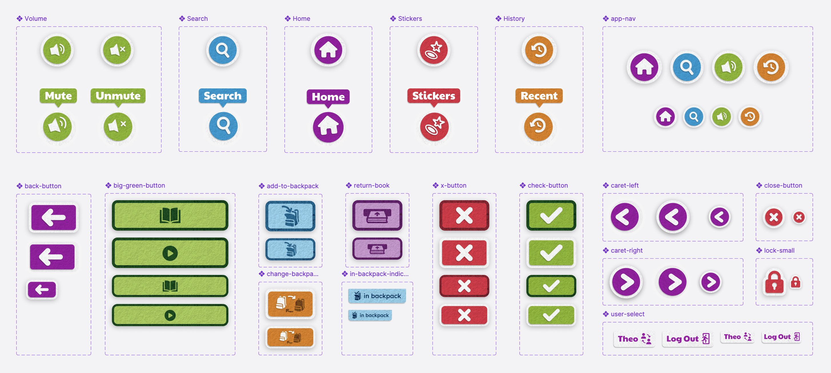
The full suite of buttons sized for desktop and mobile
UX decisions, informed by visual thinking
A lot of UX choices were shaped by the visual language itself. The layered, paper-based metaphor helped:
Clarify actionable items with consistent color, shadow, and border usage.
Make hover states feel intentional and exciting
Create separation between content and controls in a way kids can intuit
In many cases, visual cues did as much work as written labels, for instance: I spent a good bit of time iterating on the return book icon, to make sure we are clearly communicating the intended action in the simplest way possible. Some other notable examples include the add to backpack, in backpack, and switch user icons.
The home screen browsing experience in action
The backpack experience in action
Outcome
As of December 2025, Skybrary holds a validating 4.6-star rating on the App Store.
And while we don’t yet have download metrics, the client is beyond excited with what we were able to achieve in updating their app. It was a deeply rewarding experience to affect positive change on their goal of getting a book into the hands of every child, and I am proud to have done some of my best work on it.

Skybrary® is owned by Reading is Fundamental, and the work detailed here is simply a record of my part of the app design effort. The above work was performed by myself while part of the team at Savas Labs, and could not have been possible without input and feedback from my dedicated colleagues and the incredible folks at Reading is Fundamental.